It was Luxembourg’s Leon Krier whose transformative polemic in the 1970’s and 80’s shaped America’s New Urbanism of the 90’s and 00’s and our reformation of traditional mixed-use, walkable, urbanism today. I’ve watched my city take baby steps from outlawed urbanism (’60s single-use zoning), to downtown sub-urbanism (’80s drive-thru Jiffy Lubes), to ‘safer’ Vancouver urbanism (’00s single point towers surrounded by suburban townhouses). And, over these 40 years this one truth has been drummed into our downtown urban design consciousness, “just get the ground floor right” and everything else will be fine.
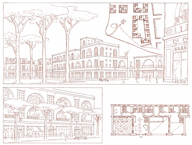
Leon Krier’s Studies of Traditional Urban Patterns has Decidedly Influenced our Cities of Today (Image Courtesy of LKrier)
So, we’ve stopped clipping the traditional, walkable, grid with new freeway off/on ramps. We are returning fast, one-way streets leading to those freeways into more humane, shopping promenades. We’ve added streetcars, jitneys, car and bike share stations, and protected bike lanes to help us get around. Small parks, plazas, and parklets spout up in vacant lots and street corners to slow us down and smell the coffee and craft beer. We are seriously endeavoring to repair our urban street pattern with infill redevelopment projects filling in and firming up our street walls as this interface supports the vitality and exhilaration of being downtown.
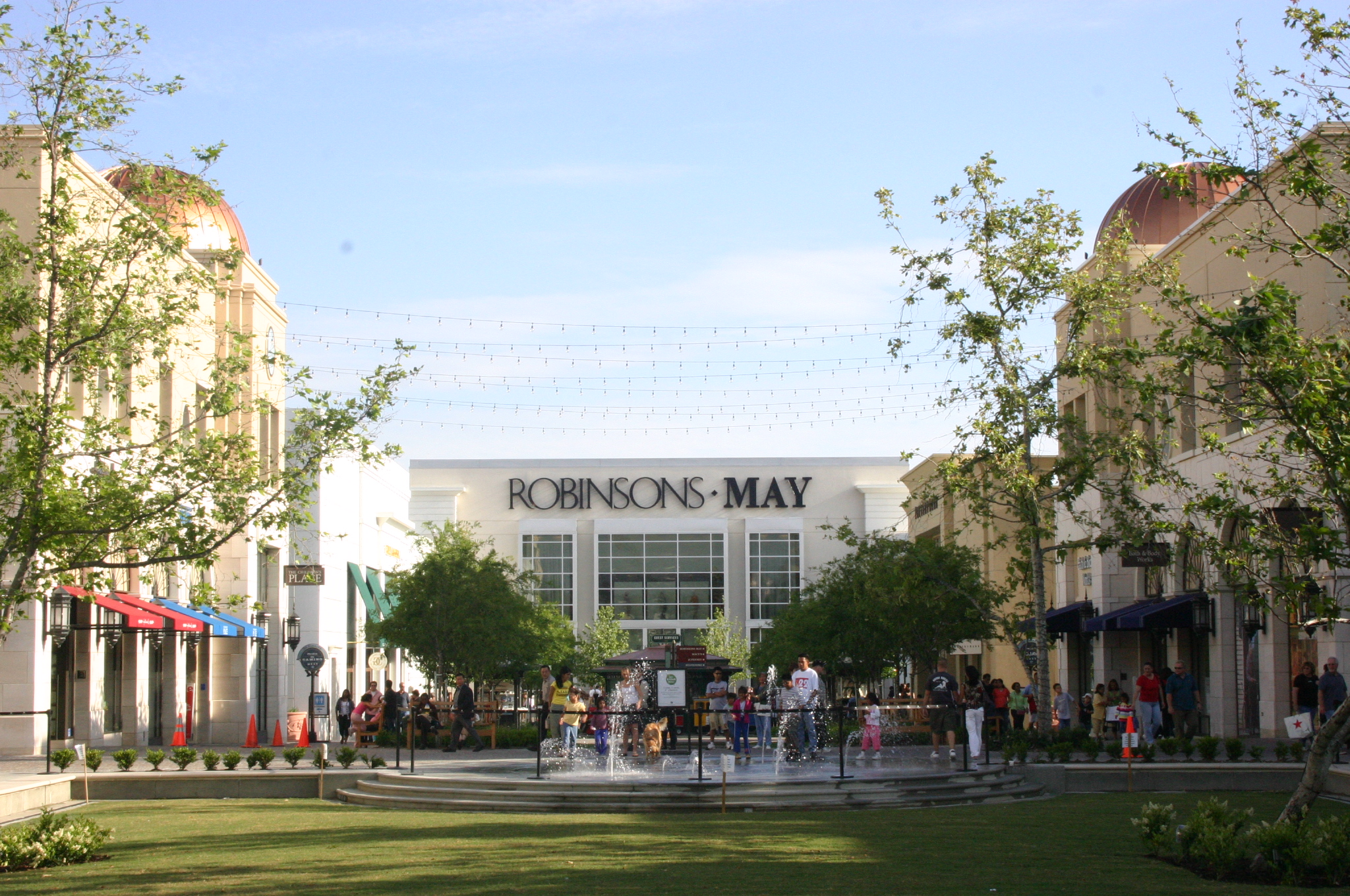
With this 2-dimensional base being well laid, downtown agencies are successfully getting new developers to build their 3-dimensional building’s ground floors in a more humane manner. The market supports this trend and every project’s ground floor has clear window shopfronts, and detailed transoms and awnings have returned with restrained signage, public restrooms, and shops spilling out onto the sidewalk. And nobody dares to dispute getting this first ground floor layer right. The 2D traditional urban street pattern has crept up to shape the 3D base of new architectural design… again, in a more traditional, humane manner.

New Ground Floors that Work (Americana by Rick Caruso)

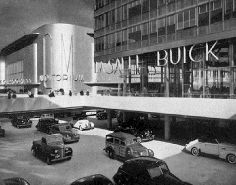
Rebuked Modernist Ground Floor Ideal (’39 Expo Futurama – Wikipedia Image)
And, here is where we find the last bastion of of the modernist architecture… fighting for survival in the materials, shapes, forms, and style of the building’s upper floors. Garish, look-at-me architecture still reigns in this narrow 25 to 140 feet range above the ground floor.

Seen One of These Proposed for Your Downtown Yet? (Image: LA Streetsblog)
I find it interesting that modernism has evolved from being a very big idea, to its ubiquitous mid-century development standard, to its now marginalized position between the ground floor and roofline. I completely agree with Witold Rybczynski that modernist architecture fits best in a natural setting, as well with Leon when it sits in juxtaposition to traditional architecture and urbanism.

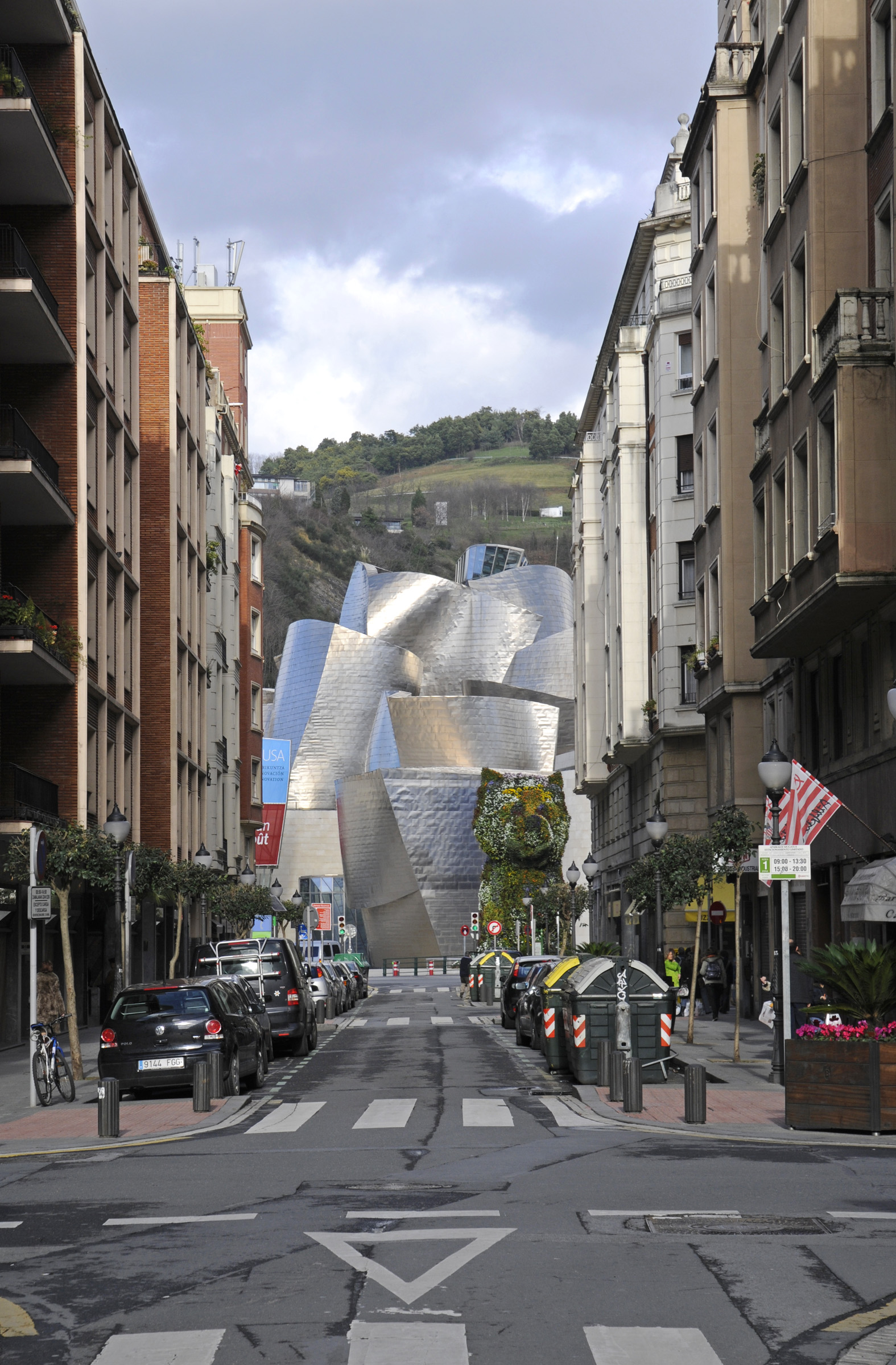
Bilbao’s Big Idea Wasn’t, “Hire a Starchitect!” It was Learning How to Architecturally Tune a Place to Create Visual and Cultural Complexity! (Image Unattributed)
John Nolen, San Diego’s original urban planner, once wrote in 1907 that city planning finds, “A place for everything, with everything in its place.” Having been tested and vetted over three generations, maybe modernist architecture has finally found its appropriate place in our everyday life… within a very narrow range pushed as far away from people as possible.

Good Riddance! (Image by HBlackson)